

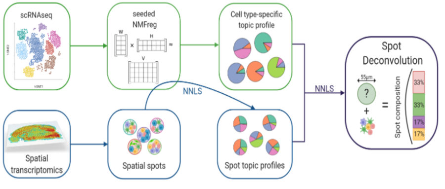
现在10x Visium数据基础的分析思路是将每个spot看作一个细胞,然后参考单细胞转录组的分析思路进行分析。但是现在的实验中,单个spot中包含不仅是一个细胞。如何确定每个spot中包含的细胞,对于空间转录组的分析是有帮助的。SPOTlight可以结合单细胞RNA测序信息反卷积空间数据,识别每个spot中的细胞类型和比例。
安装
##安装稳定版
devtools::install_github(“https://github.com/MarcElosua/SPOTlight”)
##安装开发版
devtools::install_github(“https://github.com/MarcElosua/SPOTlight”, ref = “devel”)
测试数据的获取
可以从https://github.com/MarcElosua/SPOTlight和https://satijalab.org/seurat/v3.2/spatial_vignette.html,获取10x空间转录组数据和配套的单细胞数据,作为测试数据集。
数据的加载与分析
单细胞数据:
##单细胞数据处理
sc_data <- readRDS(“../data/allen_cortex_dwn.rds”)
##常规处理
sc_data <- Seurat::SCTransform(sc_data , verbose = FALSE)
sc_data <-sc_data %>% Seurat::RunPCA(verbose = FALSE) %>%
Seurat::RunUMAP(dims = 1:30, verbose = FALSE) %>%
Seurat::FindNeighbors(dims = 1:30, verbose = FALSE) %>%
Seurat::FindClusters(verbose = FALSE)
空间数据:
#InstallData(“stxBrain”)
anterior <- LoadData(“stxBrain”, type = “anterior1”)
anterior <- Seurat::SCTransform(anterior, assay = “Spatial”, verbose = FALSE)
anterior <- anterior %>% Seurat::RunPCA(verbose = FALSE) %>%
Seurat::RunUMAP(dims = 1:30, verbose = FALSE) %>%
Seurat::FindNeighbors(dims = 1:30, verbose = FALSE) %>%
Seurat::FindClusters(verbose = FALSE)
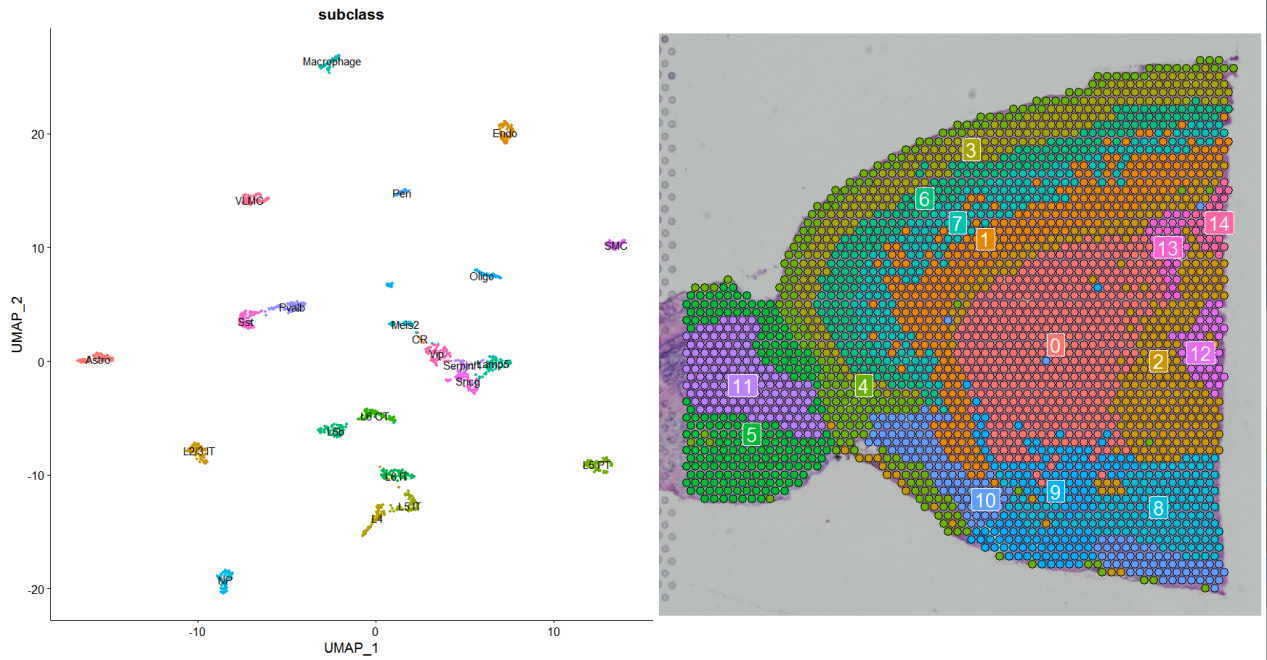
简单的可视化
sc_p <- DimPlot(sc_data,reduction = “umap”,label = T,group.by = “subclass”)*NoLegend()
st_p <- Seurat::SpatialDimPlot(anterior,label = T)*NoLegend()
sc_p+st_p
SPOTlight的使用
1.获得单细胞不同亚型细胞的marker基因:
###find marker gene
Idents(object = sc_data)
Seurat::Idents(object = sc_data) <- sc_data@meta.data$subclass
cluster_markers_all <- Seurat::FindAllMarkers(object = sc_data,
assay = “SCT”,
slot = “data”,
verbose = TRUE,
only.pos = TRUE,
logfc.threshold = 1,
min.pct = 0.9)
参数设置:
1)从SCT的data数据中获取差异基因,为了获得所有可能的差异基因而不仅是高突变基因中的差异基因;
2)只选择在cluster表达的基因,only.pos=T;
3)选择在同类细胞中绝大多数细胞都表达的基因,min.pct=0.9。
2. 利用单细胞数据对空间表达数据进行反卷积:
set.seed(123)
spotlight_ls <- spotlight_deconvolution(se_sc = sc_data,
counts_spatial = anterior@assays$Spatial@counts,
clust_vr = “subclass”,
cluster_markers = cluster_markers_all,
cl_n = 50,
hvg = 3000,
ntop = NULL,
transf = “uv”,
method = “nsNMF”,
min_cont = 0.09)
?spotlight_deconvolution查看参数的详细说明
3. 获取每个Spot中细胞的组成比例
###获取每个spot中的细胞比例矩阵
decon_mtrx <- spotlight_ls[[2]]
cell_types_all <- colnames(decon_mtrx)[which(colnames(decon_mtrx) != “res_ss”)]
##将信息添加到空间数据中
anterior@meta.data <- cbind(anterior@meta.data, decon_mtrx)
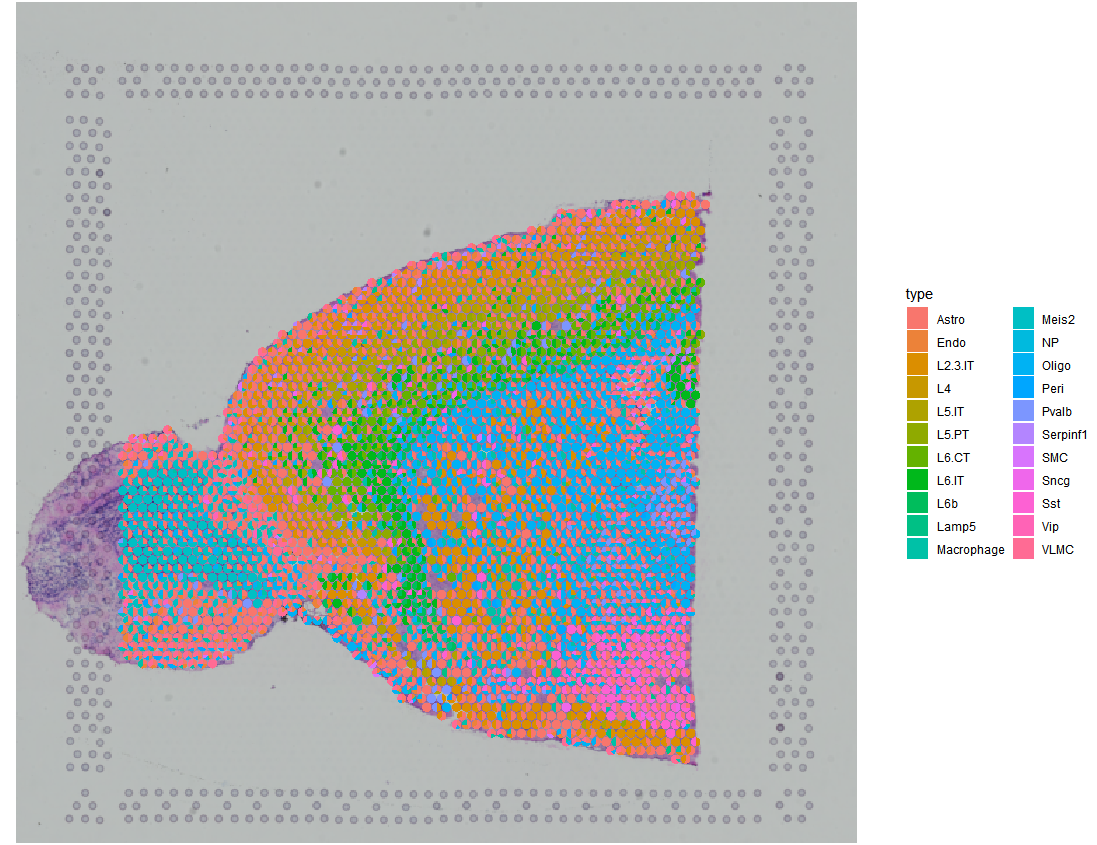
##可视化
SPOTlight::spatial_scatterpie(se_obj = anterior,
cell_types_all = cell_types_all,
img_path = “../data/spatial/tissue_lowres_image.png”,
pie_scale = 0.4)
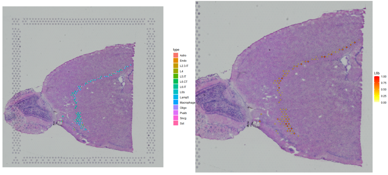
4. 特定细胞的展示
###展示特定细胞所在位置
p1 <- SPOTlight::spatial_scatterpie(se_obj = anterior,
cell_types_all = cell_types_all,
img_path = “../data/spatial/tissue_lowres_image.png”,
cell_types_interest = “L6b”,
pie_scale = 0.5)
###展示特定细胞的表达情况
p2 <- SpatialFeaturePlot(anterior,
features = “L6b”,
pt.size.factor = 1,
alpha = c(0, 1)) +theme(legend.position = “right”)+
ggplot2::scale_fill_gradientn(
colours = heat.colors(10, rev = TRUE),
limits = c(0, 1))
p1+p2
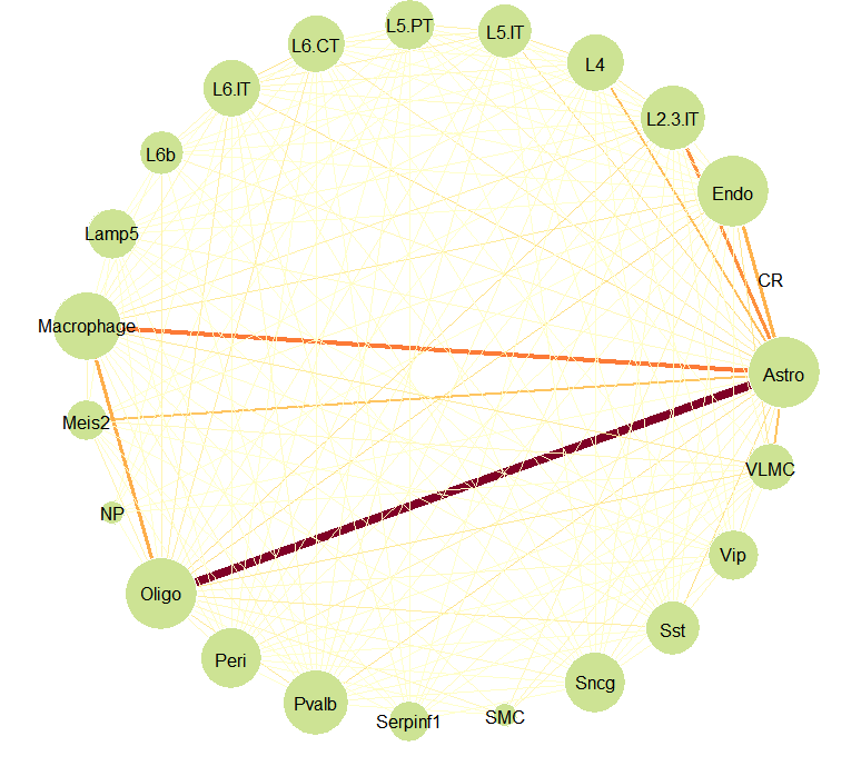
5. 空间交互信息的获取展示
在获取了每个spot的细胞类型后,可以利用get_spatial_interaction_graph获得细胞在空间中的相互作用的信息。
###空间交互信息
graph_ntw <- get_spatial_interaction_graph(decon_mtrx = decon_mtrx[, cell_types_all])
graph_ntw
[1] Astro–Endo Astro–L2.3.IT Astro–L4
[4] Astro–L5.IT Astro–L5.PT Astro–L6.CT
[7] Astro–L6.IT Astro–L6b Astro–Lamp5
[10] Astro–Macrophage Astro–Meis2 Astro–NP
[13] Astro–Oligo Astro–Peri Astro–Pvalb
[16] Astro–Serpinf1 Astro–SMC Astro–Sncg
[19] Astro–Sst Astro–Vip Astro–VLMC
[22] Endo –L2.3.IT Endo –L4 Endo –L5.IT
###绘图
library(igraph)
library(RColorBrewer)
deg <- degree(graph_ntw, mode=”all”)
# Get color palette for difusion
edge_importance <- E(graph_ntw)$importance
# Select a continuous palette
qual_col_pals <- brewer.pal.info[brewer.pal.info$category == ‘seq’,]
# Create a color palette
getPalette <- colorRampPalette(brewer.pal(9, “YlOrRd”))
# Get how many values we need
grad_edge <- seq(0, max(edge_importance), 0.1)
# Generate extended gradient palette dataframe
graph_col_df <- data.frame(value = as.character(grad_edge),
color = getPalette(length(grad_edge)),
stringsAsFactors = FALSE)
# Assign color to each edge
color_edge <- data.frame(value = as.character(round(edge_importance, 1)), stringsAsFactors = FALSE) %>%
dplyr::left_join(graph_col_df, by = “value”) %>%
dplyr::pull(color)
# Open a pdf file
plot(graph_ntw,
# Size of the edge
edge.width = edge_importance,
edge.color = color_edge,
# Size of the buble
vertex.size = deg,
vertex.color = “#cde394”,
vertex.frame.color = “white”,
vertex.label.color = “black”,
vertex.label.family = “Ubuntu”, # Font family of the label (e.g.“Times”, “Helvetica”)
layout = layout.circle)
以上,便是SPOTlight的简单使用的展示,读者有兴趣还可以将SPOTlight获得结果与Seurat中的单细胞和空间的联合分析的结果进行比较。


 京公网安备 11011302003368号